At Radical1, every detail is intentional. They provide personalized care, not just to your body, but to your sense of self. This is why we needed to make sure that their branding was intentional and had that same heart.
Exploration
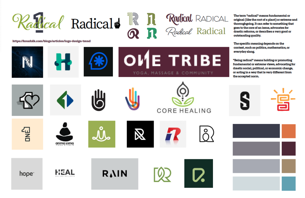
Our process starts with exploration. Figuring out your brand, your audience, your voice. We find colors and shapes that make sense. In this case, we had predetermined colors, and we knew we wanted a friendlier tone. We came up with imagery that could resonate with the client and the industry. We also took into account what “Radical” means and what it looks like in reference to the work that’s being done. Another approach we wanted to look into was a straightforward number and letter icon and see how the client felt about it. We present all of our ideas very loosely to see what the client likes. This is not work that we have done ourselves, more just a concept board to understand the aesthetic and direction the client wants to go in.
Refinement
Refinement takes time, care, and intention. Each version of the logo built upon the last, bringing us closer to a visual expression that truly reflects the purpose behind the Radical 1 brand. Throughout this process, our focus remained on capturing the heart of our client’s vision, her deep commitment to creating a welcoming, thoughtful experience for every person who walks through the door. The final result speaks to the care, attention, and genuine connection each client is met with at Radical 1.
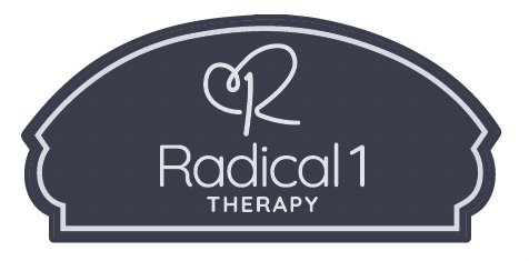
Establishing the Brand
After several rounds of iteration and refinement, we arrived at a final logo that reflects our client’s warmth, care, and approachability. This mark serves as the foundation of the entire brand system, informing the website as well as all print and digital materials.
The logo also establishes the brand’s color palette. For Radical 1, these colors were originally inspired by the building’s interior—specifically the wall colors selected by the owner. This intentional choice creates a cohesive connection between the physical space and the brand identity, uniting the in-person experience with all branded collateral.
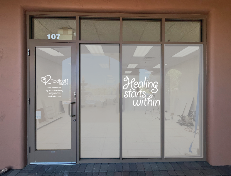
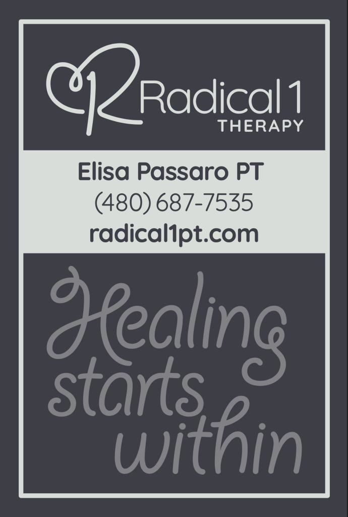
Applying the Brand
Applying the brand is about creating consistency and intention across every touchpoint. From the website to print and digital materials, each application was designed to reflect the warmth, care, and approachability at the core of Radical 1. By carrying the brand through every detail, we ensured a cohesive experience that feels thoughtful, welcoming, and true to the business, both online and in person. In the case of Radical 1 we had the pleasure of creating everything from brochures to paperwork clients fill out to signage. Making sure every detail followed branding guidelines and felt cohesive.
Development & Function
The final stage of our process is where everything comes together. We build out the website, thoughtfully assembling each piece to ensure it looks beautiful and functions seamlessly on every screen size. This phase is collaborative and detail-driven, giving the client the opportunity to review the site and share any additions or adjustments they’d like to make, which is why it’s often the longest part of the process. We carefully test and retest every page and user journey to ensure the final result delivers a smooth, intuitive, and enjoyable experience from start to finish.